A walk down my memory lane...
Educational Design
A preschool design that universally accommodates, utilizes a multi-colored color scheme, and promotes learning through displaying abstract art.
Furniture Design
A custom designed built-in bed for a high profile client (Mr. & Mrs. Schwartzenegger...LOL), which combines traditional old world design with modern details, and accommodates the clients' physical attributes. Complete with a scaled model!
Residential Design
A residential design for the Manchesters that relays high-end luxury and elegance.
Moving Spaces Design
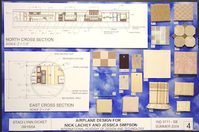
A 737 design for Jessica Simpson & Nick Lachey (before they divorced). Utilizing the same neutral color scheme and chic style that is present in the couples' home, a familiar space is created high above the clouds.
Hospitality Design
The design of Hotel Tampa is inspired by the storybook, Alice in Wonderland. It combines column chess pieces, black and white checkered tile floor, and overly scaled furniture to create a nostalgic environment that reminds everyone of the joys of being a child. Complete with a restaurant called, "Through the Looking Glass."
Government Design
"My Backyard" was a waiting room design for young children to play while waiting to testify in a county courthouse.
3D CAD Design
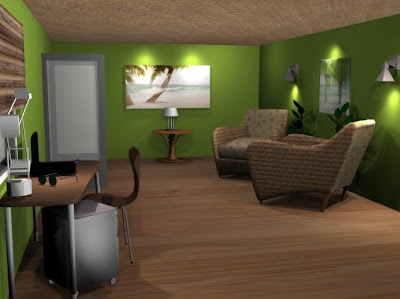
Wow!! Times and technologies have changed! This was a tropical bachelor pad located in Hawaii.
STILL, my personal favorite...
Senior Project - Hospitality Design
An entertainment complex called DeZonde ("sin" in Danish), located in Amsterdam's red light district. The inspiration is rooted from the seven deadly sins, and is a place that allows a visitor to indulge in each of the well known sins. Each different area had a different color scheme and design. Vanity was purple and had cameras all over the building that allowed visitors to watch others, as well as themselves partake in the sinful activities. The Lust area was dark blue, and created a space for the visitors to partake in the activity that the red light district is know for. Orange, was all about gluttony, which had an extensive wine collection and each table had its own chocolate fountain. Greed was gold, which had an array of different casino games and cash counter. Anger became the place to release your aggressions with a gladiator-style fighting competition, of course, red! A room of light blue pillows, beds, and fluffy furniture became the hang out for visitors to release their slothful side. Envy was the VIP room, and created envy in everyone who could not enter the luxurious room. The restrooms were neutral, with an all black color scheme and clean design. Central to the building was an all white bar, called "Salvation." This project was so much fun to work on and yes, present in front of industry professionals!


No comments:
Post a Comment